
Information Center
Your Health. Your Family. Your Choice.
|
|
National Vaccine Information Center Your Health. Your Family. Your Choice. |
The MedAlerts Blog |
This month I will look at map reports which both MedAlerts and CDC Wonder offer. The map shows the density of VAERS events that occur in each state. However, no matter what you ask, it always looks more-or-less the same, because the states with the highest population always have the largest number of VAERS events. Here are four different map views of VAERS data:
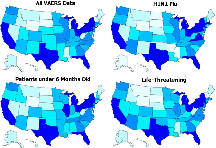
This is not news.
What is really needed is to adjust the map so that it accounts for the population and shows the proportion of people in each state who are affected. And of course, MedAlerts is able to do that.
To show an adjusted map that accounts for population, you must first check "Expert Mode" in the upper-right of the search form. This offers a new option under "Show Map" called "Adjust for Census". What it does is to take 2009 estimated state populations and adjust the results so that they describe per-capita proportions. When you do this, the above four maps look much different:
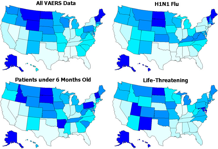
Why do the northern states have more VAERS events per person? Could this be related to the cold weather and the Flu? Let's find out.
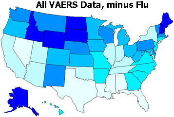
Another feature of MedAlerts in "Expert Mode" is the ability to reverse a vaccine search so that, instead of looking for VAERS events with a given vaccine, it looks for VAERS events without a given vaccine. So under the vaccine choices, next to "Selected Vaccines", check "Excluded". Then choose the four Flu vaccines. The result is here:
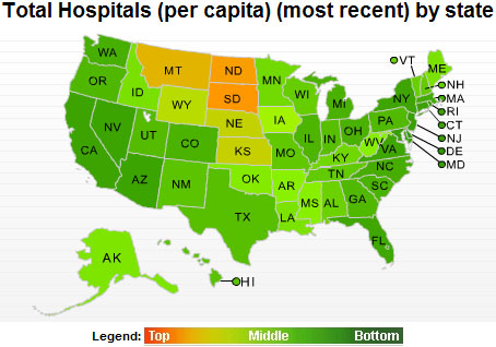
What else could explain this map? I looked at a number of factors, including per-capita income by state, health-care spending by state, and health facilities by state. One measure does match: the number of hospitals per person. But it matches in reverse. The map below, from the now-defunct statemaster.com website, shows the density of hospitals in each state, with dark green being the lowest, and yellow/orange being the highest.
<< 4/2010: Getting multiple vaccines at one time 6/2010: Autism and VAERS data >>
Copyright ©
2024 National Vaccine Information Center. All rights reserved.
21525 Ridgetop Circle, Suite 100, Sterling, VA 20166