
Information Center
Your Health. Your Family. Your Choice.
|
|
National Vaccine Information Center Your Health. Your Family. Your Choice. |
The MedAlerts Blog |
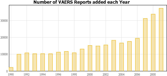
Now that 2009 is over, it is interesting to look at the growth of VAERS reports over its 20-year history. Here is a graph of the number of reports that were added to VAERS each year. You can see this result for yourself by going to the MedAlerts search page and graphing "Year of Appearance". Note that 1990 has a small number of reports because it was the first year of operation and does not represent a full year of data collection. In the remaining graphs of this report, I will ignore 1990.
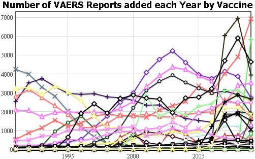
Let's go back to MedAlerts and graph the individual vaccines over the last 20 years. Below is the graph of "Year of Appearance" and "Vaccine". Unfortunately, there are over 70 vaccines, so the result is a jumbled mess that is hard to interpret.
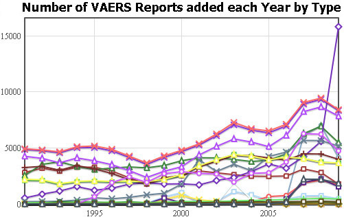
The reporting of "Vaccine Type" organizes vaccines according to the diseases that they address. Some vaccine types are straight-forward (the YF vaccine is the only one of type "Yellow Fever"). Many vaccines have multiple types (the MMR vaccine has the types "Measles", "Mumps", and "Rubella") and many vaccine types have multiple vaccines in them (there are 19 different vaccines with the type "Diphtheria"). If you want the full list of types associated with each vaccine, see the list of MedAlerts abbreviations. Graphing the vaccine type is useful because there are three times fewer vaccine types than vaccines, so this reduces clutter and may provide some insight into what is going on. Here is that graph of the "Year of Appearance" and "Vaccine Type".
Tip of the Month for using MedAlerts
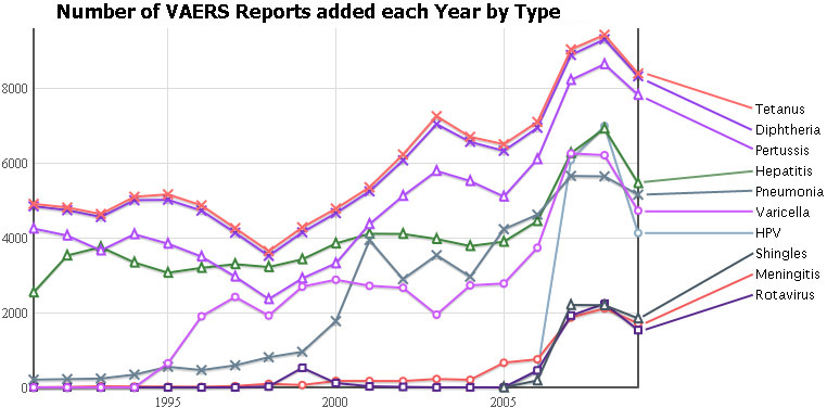
MedAlerts graphs are very powerful and can be changed on the fly. For example, each line of a graph can be removed simply by unchecking its name in the legend area below the graph. This makes it easy to remove clutter quickly and find the relevant curves, as I showed above. Another graphing tip is that you can see the data behind a particular point in the graph by placing the mouse over that point and waiting for a "tooltip" to appear. You can also change many other aspects of a graph without redrawing the web page because Medalerts graphs are "live" and very powerful. See the graphing help page for more information.
<< 12/2009: HPV vs. Flu adverse event rates 2/2010: MedAlerts vs. CDC Wonder >>
Copyright ©
2026 National Vaccine Information Center. All rights reserved.
21525 Ridgetop Circle, Suite 100, Sterling, VA 20166