Presentations (Section 1)
Section 1 of the Search Form
lets you select how the chosen VAERS cases will be presented.
There are four different presentations, any of which can be choosen:
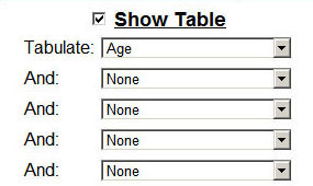
- Show Table requests a table that summarizes certain fields of the chosen cases.
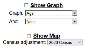
- Show Graph requests a graph that charts certain fields of the chosen cases.
- Show Map requests a U.S. map that has been colorized to show the density of cases in each state.
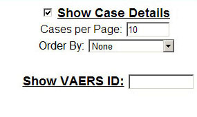
- Show Case Details and Show VAERS ID requests a complete display of every field in the chosen cases.
Groupings
When making a Table or Graph, you have a choice of different groupings.
Tables can handle to up to five different groupings; Graphs can handle up to two different groupings.
The possible groupings are:
- Symptoms groups by the Symptom Keywords.
- Vaccine groups by the Vaccines codes.
- Vaccine Type groups by the diseases that the Vaccines addresses.
- Vaccine Manufacturer groups by the Manufacturers of vaccines.
- Vaccine & Manufacturer groups by each known combination of Vaccine and Manufacturer.
- Vaccine & Manufacturer & Lot groups by each known combination of Vaccine, Manufacturer, and Lot Number.
- Vaccine Count groups by the number of vaccines that were administered at the same time.
- Vaccine Dose groups by the vaccination dose numbers.
- Vaccine Route groups by the vaccination routes.
- Vaccine Site groups by the vaccination sites.
- Vaccine Name groups by the vaccine brand names.
- Administration groups by the type of organization that administered the vaccine.
- Funding groups by the type of organization that paid for the vaccine.
- Event Outcome groups by the different outcome boxes checked (Recovered, Hospitalized, etc.)
- VAERS Form groups by the different types of intake forms (1.0 up to 2017, 2.0 from 2017 onward)
- Recovered groups by whether or not the patient recovered.
- Serious groups four event categories (Death, Life Threatening, Disabled, and Hospitalized).
- Allergies groups allergy data.
- Onset Interval groups by number of days between the vaccination and the injury onset.
- Location groups by the state or territory of residence of the patient.
- Age groups by the age of the patient.
- Sex groups by the sex of the patient.
- Year of Vaccination groups by the year the vaccine was given.
- Year & Month of Vaccination groups by the year and month the vaccine was given.
- Year, Month, & Day of Vaccination groups by the year, month, and day the vaccine was given.
- Year of Onset groups by the year of the injury onset.
- Year & Month of Onset groups by the year and month of the injury onset.
- Year, Month, & Day of Onset groups by the year, month, and day of the injury onset.
- Year of Submission to VAERS groups by the year the case was submitted.
- Year & Month of Submission to VAERS groups by the year and month the case was submitted.
- Year, Month, & Day of Submission to VAERS groups by the year, month, and day the case was submitted.
- Year of Appearance in VAERS groups by the year the case was available.
- Year & Month of Appearance in VAERS groups by the year and month the case was available.
- Year, Month, & Day of Appearance in VAERS groups by the year, month, and day the case was available.
- Year of Death groups by the year the patient died.
- Year & Month of Death groups by the year and month the patient died.
- Year, Month, & Day of Death groups by the year, month, and day the patient died.
Tables
Tables allows you to group the chosen cases in up to five different categories at once.
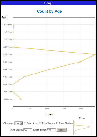
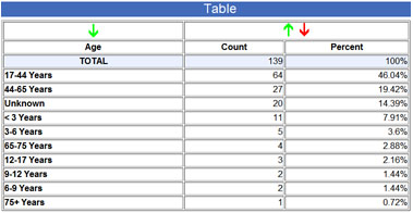
The default is a grouping by Age, and a sample Age table is shown in the top-left below.
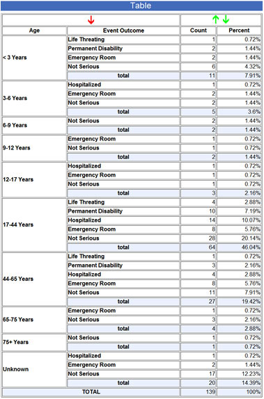
If a second grouping is chosen, the table is larger and shows the second category as a subgroup of the first
(the example on the right is a two-level table, by Age and Event Outcome).
Tables can be up to five levels deep.
Tablulate Age:
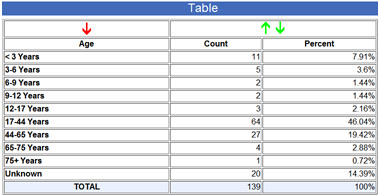
Age, sorted descending by result:
Tabulate Age and Outcome Category:
The arrows at the top of the table allow it to be sorted differently.
The red arrow indicates the current sorting and the green arrows indicate the
other possible sortings.
The initial sorting, shown in the two top examples, is the natural ordering of the group elements.
The arrows on the right side let you sort by the result values, either ascending or descending.
The lower left example shows the Age table sorted by descending result values.
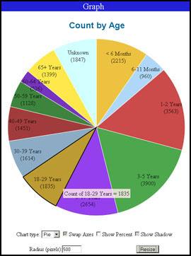
Graphs
Graphs allows you to chart some of the fields in the chosen cases.
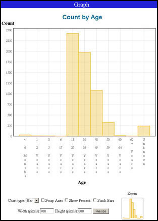
The default is to graph by Age, as shown in the top-left below.
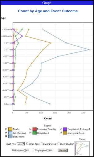
If a second grouping is chosen, the graph has multiple lines for each of
the second group's elements
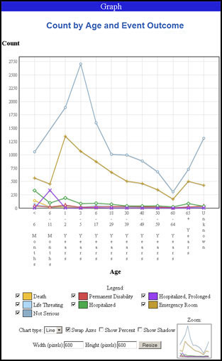
(the example in the lower-left is a two-level graph).
Below the graph are check boxes and other controls that let you change
the way the graph is presented.
- Legend for graphs with two groupings, a legend is shown identifying the different lines.
Checkboxes next to each entry let you turn the line on and off.
- Chart Type sets the style of the graph (line, bar, or pie).
The upper-right example above shows the bar chart equivalent of the line graph in the upper-left.
A sample pie chart is shown below.
- Swap Axes requests that the horizontal and vertical axes be swapped.
In the examples above, the lower-right example shows the swapped equivalent of the lower-left example.
This applies only to line and bar graphs.
- Show Percent requests that percentage values be graphed instead of total counts.
- Show Shadow toggles a shadow under the lines and dots (only in line graphs).
- Stack Bars toggles the stacking of bars in a group (as opposed to offsetting the bars in a group).
Applies only to bar graphs that have two groupings.
- Width/Height requests that the overall graph size be changed.
After setting the number of pixels in the Width and Height fields,
click the Resize button to redraw the graph.
For Pie graphs, a Radius can be set.
- Zoom shows a small overview of the graph in which you can click and drag an area.
This will be the area that is presented in the main graph.
You can also click and drag in the main graph to zoom into an area.
Zooming works only for Line and Bar graphs.
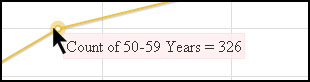
If you hover the mouse over any point in the graph, you will see the value at that point.
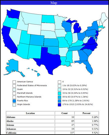
Maps
Maps display a map of the United States
that has been colorized to show the density of cases in each state and territory.
An example is shown here.
Included with the map is a table showing the actual state values.
Maps can be adjusted for census data so that, instead of showing the total number of cases that occurred in each state,
they show the number of cases per person in each state. This normalizes the data so that highly-populated states don't always appear bad.
Choose the census data you want to apply, or disable it if you want to see the number of cases independent of population adjustment.
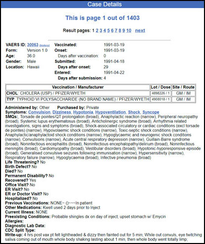
Case Details
Case Details list every chosen Case, showing all of its fields.
Two cases are shown in the example below.
If you know the VAERS identification number of a particular Case,
you can see it by entering the VAERS ID number in the box and then checking Show VAERS ID.
When you do this, none of the other search criteria in sections 2-6 will be used,
and instead the chosen result will consist of just this case.
There are two options available in Section 1 of the search form
under the "Show Case Details" checkbox.
- Cases per Page sets the number of cases that will be displayed on a single
page of the presentation.
Multiple web pages full of case details can be obtained by clicking on the Result pages
links.
- Order By requests that the cases be presented in a specific order.
The choices are:
- VAERS-ID order by the unique VAERS identification number.
- Age order by the age of the patient.
- State order by the state of residence of the patient.
- Vaccination Date order by the date the vaccine was administered.
- Onset Date order by the date the injury onset began.
- Submission Date order by the date the case was reported to VAERS.
- Entry Date order by the date that VAERS published the case.