
Information Center
Your Health. Your Family. Your Choice.
|
|
National Vaccine Information Center Your Health. Your Family. Your Choice. |
MedAlerts.org |
| Normal Usage: | Expert Mode: |
| Introduction | Introduction |
| Presentations | Presentations |
| Choosing Cases | Choosing Cases |
| Examples | Symptoms |
Here are some examples of ways to use MedAlerts.
The first example involves checking a specific vaccine. Any question can be asked of a vaccine. In this example we ask to see a graph of the number of cases over time.
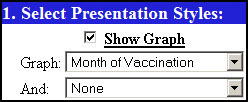
In Section 1 of the Search Form, make sure that Show Graph is checked. Set Graph to "Month of Vaccination".
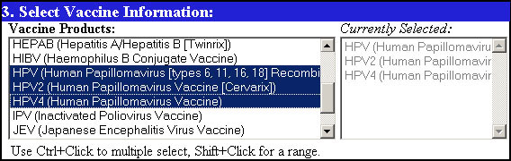
In Section 3 of the Search Form, select the vaccine of interest. You can select more than one by holding control and selecting another.
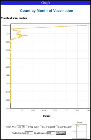
Click any Find button. You will get a graph showing the number of cases that were reported by month.
If you move the mouse over a point on the graph, details of that point will pop-up.
If you click-and-drag an area of the graph, the graph will zoom into that area. You can also zoom by click-and-dragging an area in the Zoom thumbnail in the lower-right.
This example focuses on a specific vaccine and asks for a map showing where the patients live. To see such a map:
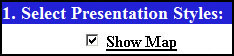
In Section 1 of the Search Form, make sure that Show Map is checked.
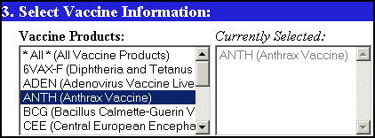
In Section 3, select the desired vaccine. You can select more than one by holding control and selecting another.
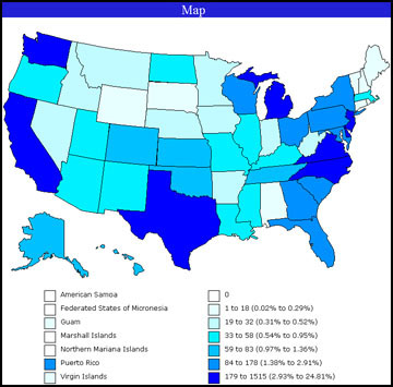
Click any Find button. The map shows state-by-state density of occurrence of the selected vaccine. Below the map is a table of results.
In this example, we find out which vaccines caused the most VAERS cases. This type of analysis can identify vaccines that may be "hot". To do a hot-vaccination analysis:
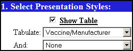
In Section 1 of the Search Form, make sure that Show Table is checked, and then set Tabulate to "Vaccine/Manufacturer". If you select "Vaccine/Manufacturer/Lot," you will get a detailed lot analysis, but it will run much more slowly.
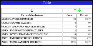
Click any Find button. You will get a long table.
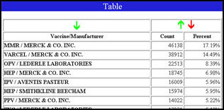
Click the green Down-Arrow in the upper-right of the table to sort the results in descending order. The list is now sorted by number of times a vaccine appears, so the vaccines with the most appearances are shown first.
Let's answer the question: which vaccine is associated with the most deaths?
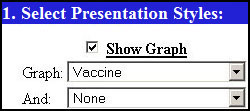
In Section 1 of the Search Form, make sure that Show Graph is checked. Set Graph to "Vaccine".
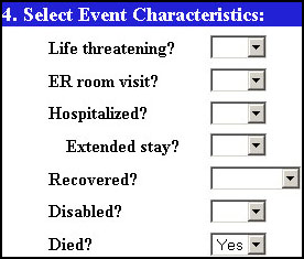
In Section 4 of the Search Form, set Died? to "Yes".
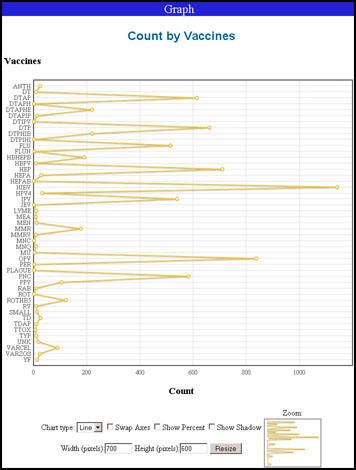
Click any Find button. You will get a graph with all vaccinations listed down the side. Those vaccines with the largest spike are associated with the most deaths.
Try setting the Chart type to "Bar" to show this as a bar-graph.
Here is an unusual question: are there vaccines that affect more men than women?
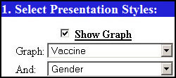
In Section 1 of the Search Form, make sure that Show Graph is checked. Set Graph to "Vaccine" and set the second grouping (And) to "Sex".
Try setting the Chart type to "Bar" to show this as a bar-graph.
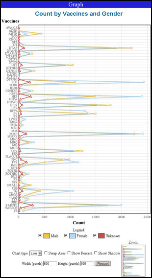
Click any Find button. You will get a graph with all vaccinations listed down the side. Three lines show the count of Cases by sex (male/female/unknown). Note that some vaccines have a more predominant yellow line (Male) and others have a predominant blue line (Female).
Hover the mouse cursor over a datapoint to see the value explained.
Try setting the Chart type to "Bar" to show this as a bar-graph.
Copyright ©
2026 National Vaccine Information Center. All rights reserved.
21525 Ridgetop Circle, Suite 100, Sterling, VA 20166